一行R代碼來實現繁瑣的可視化
ggfortify 是一個簡單易用的R軟件包�����,它可以僅僅使用一行代碼來對許多受歡迎的R軟件包結果進行二維可視化��,這讓統計學家以及數據科學家省去了許多繁瑣和重復的過程��,不用對結果進行任何處理就能以ggplot的風格畫出好看的圖�����,大大地提高了工作的效率�。
ggfortify 已經可以在 CRAN 上下載得到��,但是由于最近很多的功能都還在快速增加����,因此還是推薦大家從 Github 上下載和安裝����。
library(devtools)
install_github('sinhrks/ggfortify')
library(ggfortify)
接下來我將簡單介紹一下怎么用ggplot2和ggfortify來很快地對PCA�、聚類以及LFDA的結果進行可視化����,然后將簡單介紹用ggfortify來對時間序列進行快速可視化的方法�。
PCA (主成分分析)
ggfortify使ggplot2知道怎么詮釋PCA對象���。加載好ggfortify包之后, 你可以對stats::prcomp和stats::princomp對象使用ggplot2::autoplot�����。
library(ggfortify)
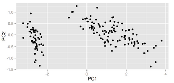
df <- iris[c(1, 2, 3, 4)]
autoplot(prcomp(df))
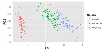
你還可以選擇數據中的一列來給畫出的點按類別自動分顏色���。輸入help(autoplot.prcomp)可以了解到更多的其他選擇�。
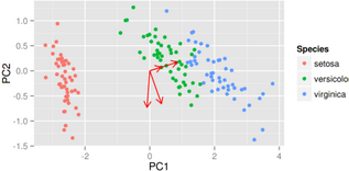
autoplot(prcomp(df), data = iris, colour = 'Species')
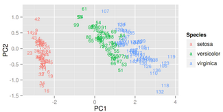
比如說給定label = TRUE可以給每個點加上標識(以rownames為標準)�����,也可以調整標識的大小��。
autoplot(prcomp(df), data = iris, colour = 'Species', label = TRUE,
label.size = 3)
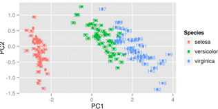
給定shape = FALSE可以讓所有的點消失�,只留下標識��,這樣可以讓圖更清晰�,辨識度更大����。
autoplot(prcomp(df), data = iris, colour = 'Species', shape = FALSE,
label.size = 3)
給定loadings = TRUE可以很快地畫出特征向量�。
autoplot(prcomp(df), data = iris, colour = 'Species', loadings = TRUE)
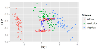
同樣的����,你也可以顯示特征向量的標識以及調整他們的大小��,更多選擇請參考幫助文件����。
autoplot(prcomp(df), data = iris, colour = 'Species',
loadings = TRUE, loadings.colour = 'blue',
loadings.label = TRUE, loadings.label.size = 3)
因子分析
和PCA類似�,ggfortify也支持stats::factanal對象��?��?烧{的選擇也很廣泛���。以下給出了簡單的例子:
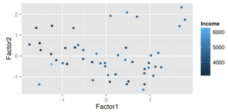
注意當你使用factanal來計算分數的話�����,你必須給定scores的值��。
d.factanal <- factanal(state.x77, factors = 3, scores = 'regression')
autoplot(d.factanal, data = state.x77, colour = 'Income')
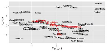
autoplot(d.factanal, label = TRUE, label.size = 3,
loadings = TRUE, loadings.label = TRUE, loadings.label.size = 3)
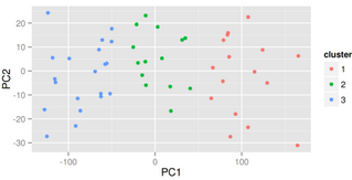
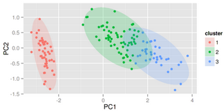
K-均值聚類
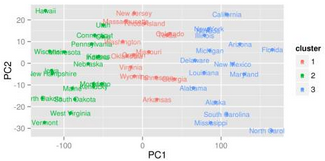
autoplot(kmeans(USArrests, 3), data = USArrests)
autoplot(kmeans(USArrests, 3), data = USArrests, label = TRUE,
label.size = 3)
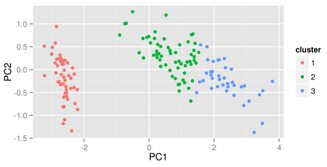
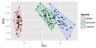
其他聚類
ggfortify也支持cluster::clara,cluster::fanny,cluster::pam�����。
library(cluster)
autoplot(clara(iris[-5], 3))
給定frame = TRUE�����,可以把stats::kmeans和cluster::*中的每個類圈出來�����。
autoplot(fanny(iris[-5], 3), frame = TRUE)
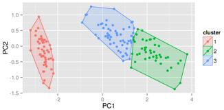
你也可以通過frame.type來選擇圈的類型��。更多選擇請參照ggplot2::stat_ellipse里面的frame.type的type關鍵詞�。
autoplot(pam(iris[-5], 3), frame = TRUE, frame.type = 'norm')
更多關于聚類方面的可視化請參考 Github 上的 Vignette 或者 Rpubs 上的例子���。
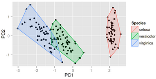
lfda(Fisher局部判別分析)
lfda包支持一系列的 Fisher 局部判別分析方法�����,包括半監督 lfda�����,非線性 lfda���。你也可以使用ggfortify來對他們的結果進行可視化�����。
library(lfda)
# Fisher局部判別分析 (LFDA)
model <- lfda(iris[-5], iris[, 5], 4, metric="plain")
autoplot(model, data = iris, frame = TRUE, frame.colour = 'Species')
# 非線性核Fisher局部判別分析 (KLFDA)
model <- klfda(kmatrixGauss(iris[-5]), iris[, 5], 4, metric="plain")
autoplot(model, data = iris, frame = TRUE, frame.colour = 'Species')
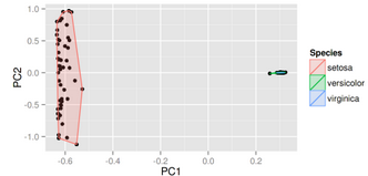
注意對iris數據來說��,不同的類之間的關系很顯然不是簡單的線性�����,這種情況下非線性的klfda 影響可能太強大而影響了可視化的效果�,在使用前請充分理解每個算法的意義以及效果����。
# 半監督Fisher局部判別分析 (SELF)
model <- self(iris[-5], iris[, 5], beta = 0.1, r = 3, metric="plain")
autoplot(model, data = iris, frame = TRUE, frame.colour = 'Species')
時間序列的可視化
用ggfortify可以使時間序列的可視化變得極其簡單�����。接下來我將給出一些簡單的例子�。
ts對象
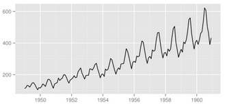
library(ggfortify)
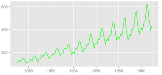
autoplot(AirPassengers)
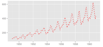
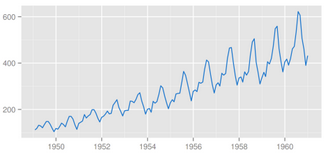
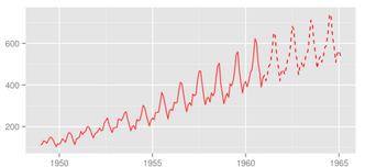
可以使用ts.colour和ts.linetype來改變線的顏色和形狀�����。更多的選擇請參考help(autoplot.ts)�。
autoplot(AirPassengers, ts.colour = 'red', ts.linetype = 'dashed')
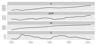
多變量時間序列
library(vars)
data(Canada)
autoplot(Canada)
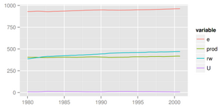
使用facets = FALSE可以把所有變量畫在一條軸上���。
autoplot(Canada, facets = FALSE)
autoplot也可以理解其他的時間序列類別�??芍С值腞包有:
zoo::zooreg
xts::xts
timeSeries::timSeries
tseries::irts
一些例子:
library(xts)
autoplot(as.xts(AirPassengers), ts.colour = 'green')
library(timeSeries)
autoplot(as.timeSeries(AirPassengers), ts.colour = ('dodgerblue3'))
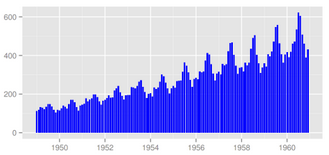
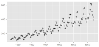
你也可以通過ts.geom來改變幾何形狀�,目前支持的有line����,bar和point�����。
autoplot(AirPassengers, ts.geom = 'bar', fill = 'blue')
autoplot(AirPassengers, ts.geom = 'point', shape = 3)
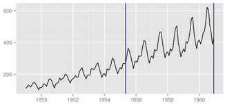
forecast包
library(forecast)
d.arima <- auto.arima(AirPassengers)
d.forecast <- forecast(d.arima, level = c(95), h = 50)
autoplot(d.forecast)
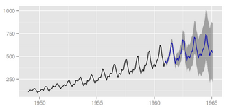
有很多設置可供調整:
autoplot(d.forecast, ts.colour = 'firebrick1', predict.colour = 'red',
predict.linetype = 'dashed', conf.int = FALSE)
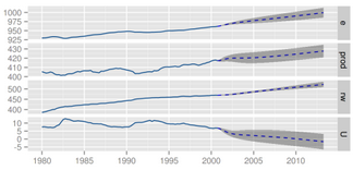
vars包
library(vars)
data(Canada)
d.vselect <- VARselect(Canada, lag.max = 5, type = 'const')$selection[1]
d.var <- VAR(Canada, p = d.vselect, type = 'const')
autoplot(predict(d.var, n.ahead = 50), ts.colour = 'dodgerblue4',
predict.colour = 'blue', predict.linetype = 'dashed')
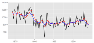
changepoint包
library(changepoint)
autoplot(cpt.meanvar(AirPassengers))
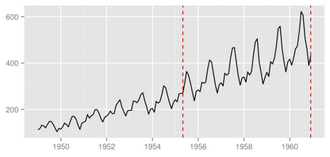
autoplot(cpt.meanvar(AirPassengers), cpt.colour = 'blue', cpt.linetype = 'solid')
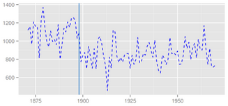
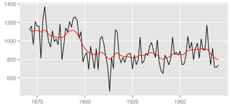
strucchange包
library(strucchange)
autoplot(breakpoints(Nile ~ 1), ts.colour = 'blue', ts.linetype = 'dashed',
cpt.colour = 'dodgerblue3', cpt.linetype = 'solid')
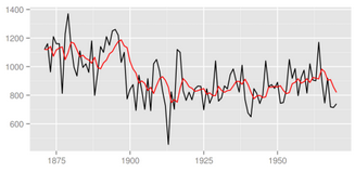
dlm包
library(dlm)
form <- function(theta){
dlmModPoly(order = 1, dV = exp(theta[1]), dW = exp(theta[2]))
}
model <- form(dlmMLE(Nile, parm = c(1, 1), form)$par)
filtered <- dlmFilter(Nile, model)
autoplot(filtered)
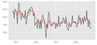
autoplot(filtered, ts.linetype = 'dashed', fitted.colour = 'blue')

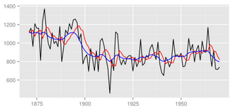
smoothed <- dlmSmooth(filtered)
autoplot(smoothed)
p <- autoplot(filtered)
autoplot(smoothed, ts.colour = 'blue', p = p)
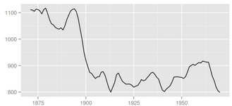
KFAS包
library(KFAS)
model <- SSModel(
Nile ~ SSMtrend(degree=1, Q=matrix(NA)), H=matrix(NA)
)
fit <- fitSSM(model=model, inits=c(log(var(Nile)),log(var(Nile))),
method="BFGS")
smoothed <- KFS(fit$model)
autoplot(smoothed)
使用smoothing='none'可以畫出過濾后的結果����。
filtered <- KFS(fit$model, filtering="mean", smoothing='none')
autoplot(filtered)
trend <- signal(smoothed, states="trend")
p <- autoplot(filtered)
autoplot(trend, ts.colour = 'blue', p = p)
stats包
可支持的stats包里的對象有:
stl,decomposed.ts
acf,pacf,ccf
spec.ar,spec.pgram
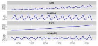
cpgramautoplot(stl(AirPassengers, s.window = 'periodic'), ts.colour = 'blue')
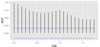
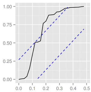
autoplot(acf(AirPassengers, plot = FALSE))
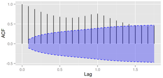
autoplot(acf(AirPassengers, plot = FALSE), conf.int.fill = '#0000FF',
conf.int.value = 0.8, conf.int.type = 'ma')
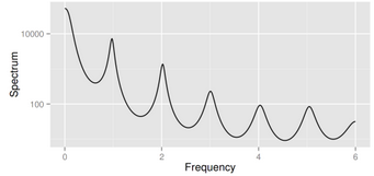
autoplot(spec.ar(AirPassengers, plot = FALSE))
ggcpgram(arima.sim(list(ar = c(0.7, -0.5)), n = 50))
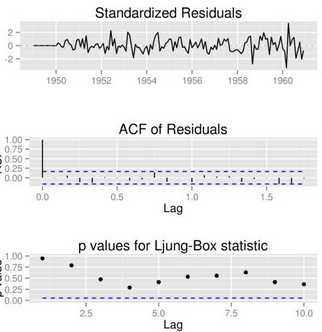
library(forecast)
ggtsdiag(auto.arima(AirPassengers))
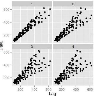
gglagplot(AirPassengers, lags = 4)
CDA數據分析師考試相關入口一覽(建議收藏):
? 想報名CDA認證考試��,點擊>>>
“CDA報名”
了解CDA考試詳情���;
? 想學習CDA考試教材�����,點擊>>> “CDA教材” 了解CDA考試詳情�����;
? 想加入CDA考試題庫��,點擊>>> “CDA題庫” 了解CDA考試詳情����;
? 想了解CDA考試含金量�����,點擊>>> “CDA含金量” 了解CDA考試詳情����;


 京公網安備 11010802034615號
經營許可證編號:京B2-20210330
京公網安備 11010802034615號
經營許可證編號:京B2-20210330
